How to Design Around ADA

ADA rules are changing and vary from location to location
The Americans with Disabilities Act (ADA) went into effect on January 26, 1992.
All of the requirements regarding interior signs have remained virtually unchanged since then. Various additions and revisions to the regulations had been under review for several years, but had not yet become federal law. However, on March 15, 2011, a new set of accessibility guidelines officially went into effect and continue to be updated. For more on this topic CLICK HERE
Font Requirements
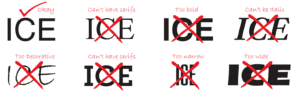
Choosing a font for your signage has always been an important decision, not only for aesthetic reasons, but for code-compliance as well. Under the new ADA guidelines, your font choices become even more limited. The letter style must be sans serif, and cannot be italic, script, highly decorative, or of other unusual forms. Characters shall be selected from fonts where the width of the uppercase “O” is 55% minimum and 110%maximum of the height of the uppercase “I”. The stroke width of the characters must be thin-15% maximum of the height of the letter “I”. If this all sounds a little confusing, don’t worry about it- just send us the font in question and we can test it to see if it is compliant.
Raised Copy Size Requirements
Any sign designating a permanent room or space, such as guest room numbers, exit signs, restroom signs, etc., must have raised copy and Braille. The copy must be raised a minimum of 1/32” and be in ALL CAPS. The copy must be 5/8” high minimum and 2” high maximum, based on the height of the uppercase letter “I”. There must be significant contrast with the background- either light copy on a dark background or vice versa. The only exception to this rule is if a Dual Sign is used. What’s a Dual Sign, you ask? Just keep reading.
Dual Signs
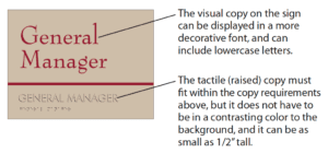
The new guidelines now offer the option of making “Dual Signs”. Basically, if you still want to use a decorative or “visual” font on your sign, you are now allowed use both visual and tactile copy on the same sign, as long as the tactile copy still meets the font requirements listed above. Remember, Dual Signs are not required, they are just a design option.
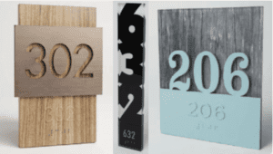
Examples of Approved Dual Signage
Braille Dimensions and Shapes
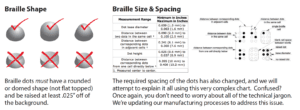
Braille on signage is nothing new, but there are some new requirements regarding the size and shape of the dots, as well as the spacing between the individual Braille dots. Inspectors will often measure the dots to ensure they are within compliance.
Other Requirements
There are a few other things that have changed regarding the mounting location of signs on the wall, copy size requirements for overhead signs, location of Braille on the signs, etc., etc., etc. You don’t really need to know anything else about this, except that we are aware of all of it, and we will make any changes necessary to ensure that your signage is 100% compliant. When we give you a quote for signage, you will receive a full-color proof, so you know exactly what the signs will look like. When you receive your signs, the shipment will include instructions that show exactly how and where to mount the signs on the wall.